
Logos Part I
04/22/2010 02:40 PM Filed in: Blog
Logos are one of those things that I love. I've always found it fascinating how a company or brand will summarize their entire existence with one image. Think about the Nike "swoosh", the ubiquitous Coca Cola script, or Apple's "apple". All of them are examples of great logos. They're easily recognized and can't be mistaken for anything else. They're also very classy and memorable. That's what goes into making a great logo. A great logo is something that uniquely describes a brand just by glancing at it. Nike's logo suggests motion. The font is sheared about 20 degrees and it looks like it's ready to leap off of the page. The "swoosh" helps give it a boost. The Coca Cola logo is classy and one of the oldest logos we still recognize every day. It's timeless and stronger today than it was almost 100 years ago. Although the Apple logo has changed a bit over the years, it's changed in the same way that the company has evolved. Their first logo was the same apple shape, but was multicolored–suggesting that their computers were a revolution like Newton's apple (which was their first logo) and a mixture of art and technology. Their current logo holds true to that philosophy while maintaining the clean minimalist lines that Apple is known for in their current design aesthetic. All of their products seem to match their logos, stores, and commercials. They have one of the best brand continuities I've ever seen.
As fate would have it, when I went to my favorite logo site to retrieve these logos, all three were featured on the website homepage.


I got into graphic design by default. When I was in college, my band (Won by One) hired an art major at GSU to design a logo for us. She failed miserably. She sent us back about seven designs that looked like she did them in Microsoft Word. They were anything but creative to say the least. We paid her $200 and had no logo. Heartbroken, I went home empty handed. Shortly after that, we changed the name of the band to Wallace Green and a friend of mine liked the name so much, he drew a logo for us on the computer. He introduced me to a piece of software called Adobe Illustrator and I was smitten. He wasn't an art student but he worked for a printing company. In just ten minutes, he had a cooler logo than the art student even dreamed of. We used the logo for about 8 years.
I knew with my drawing background I could do this and my quest had begun.
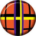
Only a few people know what font I use. Me, Chank Diesel, and Justin Samples.
I'm keeping it that way for two reasons:
1. The font doesn't work on anything else. It's a horrible font that happens to work with the Pladd Dot Logo really well. It works in a similar way that Peanut Butter and Jelly work together. Seriously. Can you think of one other type of nut that works with Jelly? I can't. But peanuts do.
2. I don't want to see the font all over the place. Trust me, the world would be an awful place if prepubescent web designers decided to smear this font all over the landscape of the internet. They're already kicking our butts in Call of Duty. Isn't that giving them enough free reign? I'm not about to give them the keys to the Buick yet...
I've designed several logos since then and some have been pretty darn good.

We've been using this logo since August of 2008 and we've had packed shows ever since...
Now I'm not a genius or anywhere near it. I do understand branding. The next blog will be a sequel to this one featuring some less than stellar logos. I'm going to talk about good design and bad design.
It should be fun....
blog comments powered by Disqus